Using bold paint colors
Paint is one of the least
expensive and most versatile
means to changing the look of
a room. 60 percent of the
colors of a home that visitors
perceive come from the paint
on the walls. Choosing a color
scheme can be challenging,
which is why so many people
stick with neutrals like beige
and white. For those who are
ready to add a spark of color,
there are a few guidelines to
consider.
Color theory is a science and
there are rules of using color
that are taught as early as a
child’s first foray into art class.
We know there are primary,
secondary and complementary
colors on the color wheel.
Even novice home decorators
can do well with color if they
use the color wheel as their
guideline.
Color should flow
throughout a house. Every
room need not be painted the
same color. However, colors
should be complementary
enough that they flow into one
another. Don’t paint one room
in child’s basic primary colors,
while painting other rooms in
jewel tones and pastels. Stick
with one theme and carry it
through the house.
Once you have decided to
use a bold color, first find your
color inspiration. Color
combinations that appear in
nature are more readily
accepted by people, so look
for an item in nature, such as
a seashell or a flowering plant
that you can base your color
choices on. Others pull
inspiration from a particular
design item. For instance,
maybe an area rug strikes your
fancy. Use colors that appear
in the rug in the room.
Keep in mind that using bold
color doesn’t mean you have
to paint every wall from
ceiling to floor in that color.
Rather, if you’re just starting
out with bold colors, select
one wall to serve as an accent
wall. Use that wall as your
bold canvas and paint it with
your chosen hue.
Some people like to
experiment with a more flashy
color in a smaller space. If
you’re nervous about
beginning in the living room
or kitchen, how about trying
out bold color in a smaller
space, such as a powder room?
A more intimate space might
seem less overwhelming when
painted in a bold color. Go for
a deep purple or another
jeweled tone. However, try to
avoid greens in the bathroom,
as they may reflect off of the
mirror and cast a hue onto
your face that makes you look
unwell. Pinks and peaches will
shed a rosy glow.
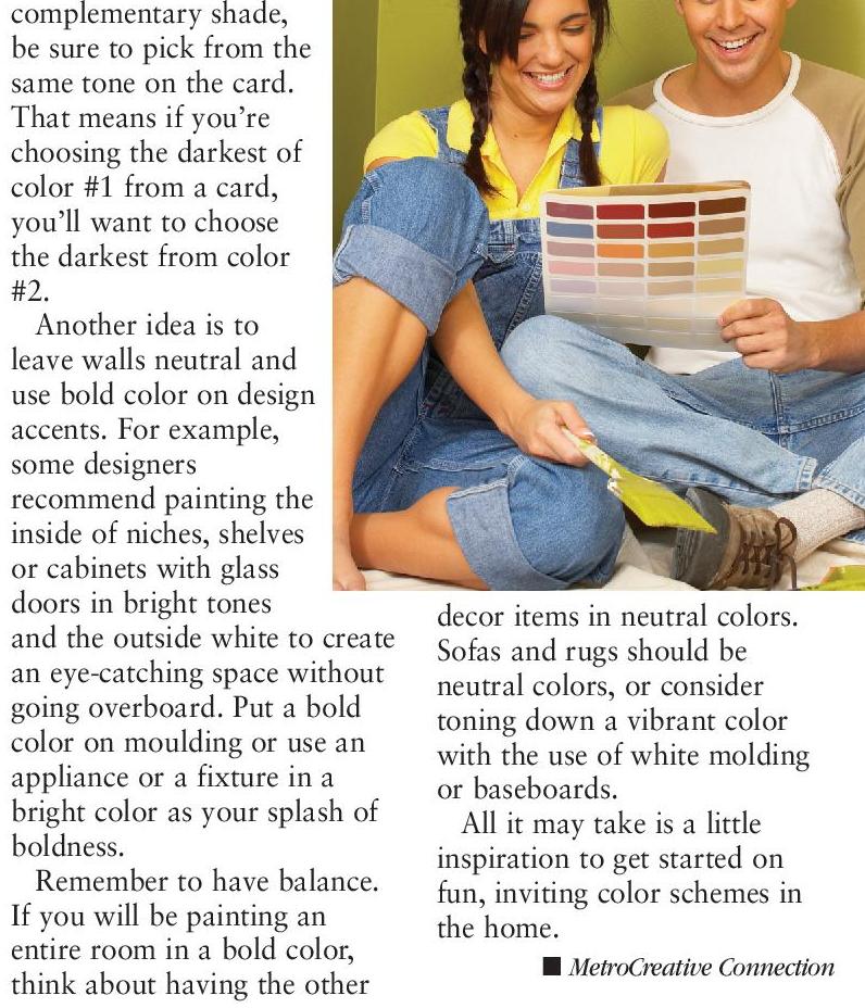
If you will be incorporating
complementary colors into the
room, use the paint color
swatch as your guide. Most
paint manufacturers use three
or four different shades on one
sample card. When selecting a
Yankton Showroom
309 W. 11th St.,
Yankton, SD 57078
605-668-2168
1-800-249-3837
www.tkplaceyankton.com
18 n TODAY’S HOME – SPRING 2013
complementary shade,
be sure to pick from the
same tone on the card.
That means if you’re
choosing the darkest of
color #1 from a card,
you’ll want to choose
the darkest from color
#2.
Another idea is to
leave walls neutral and
use bold color on design
accents. For example,
some designers
recommend painting the
inside of niches, shelves
or cabinets with glass
doors in bright tones
and the outside white to create
an eye-catching space without
going overboard. Put a bold
color on moulding or use an
appliance or a fixture in a
bright color as your splash of
boldness.
Remember to have balance.
If you will be painting an
entire room in a bold color,
think about having the other
decor items in neutral colors.
Sofas and rugs should be
neutral colors, or consider
toning down a vibrant color
with the use of white molding
or baseboards.
All it may take is a little
inspiration to get started on
fun, inviting color schemes in
the home.
n MetroCreative Connection
List Electric
RYAN LIST
Electrical Contractor
Providing you with the service you
expect and the quality you deserve.
We Now Do:
• Home & Commercial Audio
and Sound Systems
• Residential Lighting Design
• Farmstead • Residential • Commercial
OFFICE 668-9430 • CELL 661-1669


 Previous Page